
Building a website with a modern and responsive theme requires us to utilize one of the features in CSS, namely Flexible Box, better known as Flexbox. With Flexbox, we can create a responsive website layout and arrange elements neatly. In this article, we will discuss the basics of Flexbox, its definition, and examples of its use.
What is CSS Flexbox?
CSS Flexbox is a one-dimensional layout method that allows us to arrange elements within a container horizontally (row) or vertically (column). The advantages of using the Flexbox feature include:
- Creating responsive layouts without complex media queries.
- Flexibly and easily positioning elements.
- Reducing dependence on media queries.
- Supporting nested layouts.
- Facilitating the reordering of elements without changing the HTML structure.
Why Do We Need Flexbox?
Before the Flexbox feature was introduced in CSS, creating responsive layouts was a major challenge for website developers. Developers had to use complex combinations of float, clear, and positioning css just to arrange elements so that they looked neat and responsive.
Previously, we discussed CSS Positioning in detail, including its types such as relative, static, absolute, and fixed. To learn more about their usage, please refer to the following article: Learn CSS Positioning: Complete Beginner's Guide with Examples.
Flexbox Basics
To use Flexbox, you just need to add the display property to the container or parent element. For example, as shown below.
.container {
 display: flex;
}
After adding display: flex; to the container element, all child elements within it will automatically become flex items. By default, items within the Flexbox Container will be arranged horizontally (from left to right). Flexbox operates on two axes (axis):
- Main Axis (horizontal)
- Cross Axis (vertical)
Arranging Elements with Flexbox
We can change the default axis of Flexbox from horizontal to vertical. Simply add the flex-direction property to the Flexbox Container to arrange flex items horizontally or vertically. Here is an example of its use.
<!DOCTYPE>
<html>
	<head>
		<style>
			.container {
			 display: flex;
			 flex-direction: column;
			}

			.box {
			  width: 80px;
			  height: 80px;
			  margin: 8px;
			  background-color: crimson;
			}
		</style>
	</head>
	<body>
		<div class"'container">
			<div class="box">Box 1</div>
			<div class="box">Box 2</div>
			<div class="box">Box 3</div>
		</div>
	</body>
</html>
In the code example above, elements or flex items within the container class will be arranged vertically. If we want to arrange the boxes horizontally, change the value of column to row in the flex-direction property.
.container {
 display: flex;
 flex-direction: row;
}
The following are some values of the flex-direction property to determine the direction of element arrangement, including:
rowelements will be arranged horizontally.row-reverseelements will still be arranged horizontally, but from right to left.columnelements will be arranged vertically.column-reverseelements will be arranged vertically, but from bottom to top.
Setting Element Position (Horizontal) With Flexbox
To set the horizontal position of elements within a Flexbox Container, we can use the justify-content property. This property is very useful when we want to determine the placement of elements, such as whether they will be placed on the left, in the center, or evenly distributed. Here is an example of its use.
<!DOCTYPE html>
<html>
	<head>
    <title>Learn Flexbox - NganggurDev</title>
		<style>
			.container {
			 width: 40%;
       height: 400px;
			 display: flex;
       background-color: lightblue;
			 justify-content: center; /* centering an element (horizontal) */
			}

			.box {
			  width: 80px;
			  height: 80px;
			  margin: 8px;
			  background-color: crimson;
			}
		</style>
	</head>
	<body>
		<div class="container">
			<div class="box">Box 1</div>
			<div class="box">Box 2</div>
			<div class="box">Box 3</div>
		</div>
	</body>
</html>
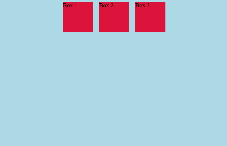 In the example above, the box or element of the Flexbox Container will be centered in the container. Why? Because we use the value
 center in the justify-content property.
Here are some common values we can use for the justify-content property:
flex-startaligns all items at the beginning of the main line (left by default).flex-endaligns items at the end of the main line (right by default).centerpositions items in the center of the container.space-betweendistributes items with equal spacing between them.space-evenlydivides the container space into exactly equal parts among the elements.
Setting Element Position (Vertical) With Flexbox
By using the align-items property, we can set the position of items within a Flexbox Container vertically. align-items sets how all items in a row are aligned relative to the height or width of the container and also depends on the flex direction (row or column). Here is an example of its use.
<!DOCTYPE html>
<html>
	<head>
    <title>Learn Flexbox - NganggurDev</title>
		<style>
			.container {
			 width: 40%;
			 height: 400px;
       background-color: lightblue;
			 display: flex;
			 justify-content: center; /* centering an element (horizontal) */
			 align-items: flex-end /* making an element appear at the end vertically */
			}

			.box {
			  width: 80px;
			  height: 80px;
			  margin: 8px;
			  background-color: crimson;
			}
		</style>
	</head>
	<body>
		<div class="container">
			<div class="box">Box 1</div>
			<div class="box">Box 2</div>
			<div class="box">Box 3</div>
		</div>
	</body>
</html>
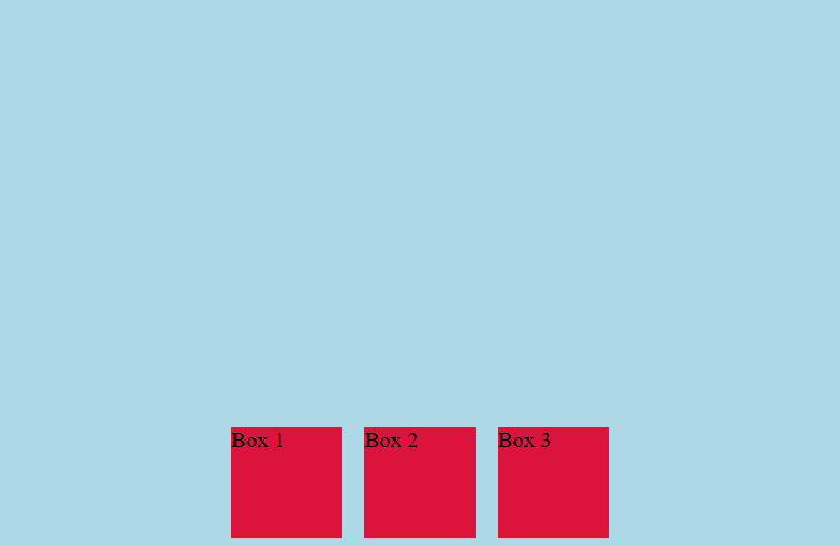 In the code example above, the box element will be centered horizontally because it uses the
 justify-content: center; property. Meanwhile, the vertical position will be at the bottom of the container because it uses the align-items: flex-end; property.
Here are some common values we can use for the align-items property:
flex-startitems will be positioned at the top of the container (row direction).flex-enditems will be positioned at the bottom of the container (row direction).centeritems will be centered vertically (row direction).
Conclusion
CSS Flexbox is a very powerful feature for creating responsive layouts easily. By understanding the basic concepts, properties, and their functions, we can create flexible and maintainable layouts.
Thank you, see you in the next article.
